How to Prepare Your Design Files for a Smooth Print Job
Beautiful design is only half the job. To get crisp, professional results from a printer, your files need to be set up correctly long before they ever reach the press. A few technical details – bleeds, color mode, resolution and fonts – can be the difference between a flawless print run and a frustrating delay.
Here’s a straightforward checklist to help you hand off print-ready files with confidence.
1. Start with the Right Document Size
Begin by creating your document at the final trim size of the piece. If your flyer is meant to be 5″ x 7″, set that as the main page size from the start rather than designing in an arbitrary dimension and scaling later. Working at 100% ensures that type, images, and details remain sharp and correctly proportioned.
If you’re designing a multi-panel piece such as a tri-fold brochure, factor in folds and panel widths at this stage. Unequal panels may be necessary so the piece folds neatly without buckling.
2. Add Bleed and Keep Important Content Safe
Any design that runs to the edge of the paper needs bleed – extra image area that extends beyond the final trim. A common standard is 1/8″ (3 mm) on all sides, but always check your printer’s requirements. Extend backgrounds, images, and color blocks into this bleed area so no white slivers appear after trimming.
At the same time, keep important text and logos inside a “safe zone,” usually at least 1/8″–1/4″ away from the trim line. This margin allows for minor variations in cutting and keeps your content visually balanced.
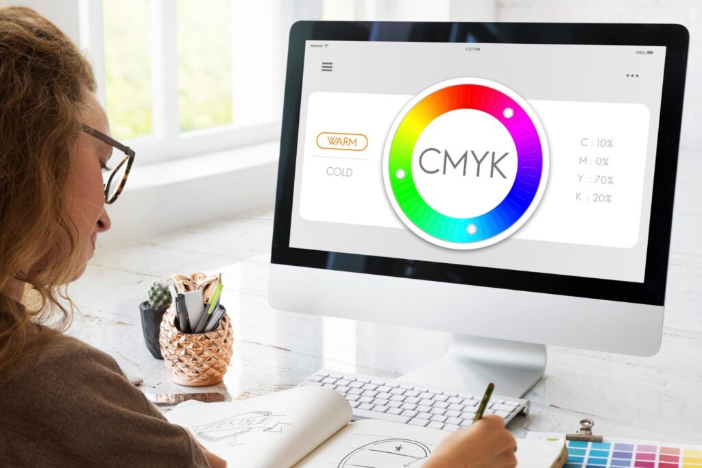
3. Use the Correct Color Mode
Screens display color in RGB light, while most presses print in CMYK ink. Design software can convert between them, but the results aren’t always predictable. For most full-color print jobs, set your document to CMYK and use CMYK values for solid colors. This reduces surprises when bright, neon-like RGB tones are translated to ink.
If your project uses spot colors (for example, a specific brand color that needs precise matching), define them as separate spot inks in your swatches panel. Make sure you and your printer are aligned on how those colors will be handled.
4. Check Image Resolution
Low-resolution images may look fine on screen but appear blurry or pixelated in print. As a general rule, photographic images should be at least 300 dpi at their final printed size. Logos and icons are best supplied as vector artwork whenever possible so they scale cleanly at any size.
Before exporting your file, zoom in closely on key areas and review image links to ensure you’re not accidentally enlarging a small web graphic far beyond its original resolution.
5. Manage Fonts Carefully
Fonts can cause problems if they’re missing, substituted, or not properly licensed. To avoid issues:
- Use professional, print-safe fonts rather than random downloads of unknown quality.
- Keep your font palette limited and consistent across the project.
- When you create a final print file, either package the document with fonts included (if your printer requests it) or convert text to outlines, according to the printer’s preference.
Converting text to outlines is useful when you need absolute assurance that type won’t reflow, but remember you’ll lose the ability to edit that text easily.
6. Pay Attention to Black and Rich Blacks
Large areas of solid black, such as backgrounds, often look patchy if printed with black ink alone. Instead, designers use a “rich black,” which combines black with small amounts of other inks to create a deeper, more even tone. Body text, however, should usually stay as 100% black only, ensuring sharp, readable type.
Ask your print provider for recommended values, and avoid creating multiple definitions of black in the same document.
7. Use the Right File Format for Output
Many printers prefer press-ready PDFs because they are stable and preserve fonts, images, and vector elements in a single file. When exporting your PDF:
- Choose a preset designed for print (such as “High Quality Print” or a custom preset from your printer).
- Include bleeds and crop marks if requested.
- Avoid downsampling images too aggressively; keep them at print-quality resolution.
If your printer asks for native application files (such as an InDesign package), send both the packaged files and a PDF so they can compare and check for discrepancies.
8. Double-Check Before You Hit Send
Finally, give your file a slow, deliberate review. Check spelling and numbers, verify contact details, confirm dates and prices, and make sure any legal copy or disclaimers are present. Look at your design at both 100% and reduced size to catch alignment issues or crowded areas.
A thoughtful proofing pass takes less time than revising a whole print run – and it protects your budget, your schedule and your brand.
Preparing print-ready files doesn’t have to be intimidating. With the right setup and a clear checklist, you can hand off artwork that moves smoothly from screen to press, letting your design – and your message – shine on paper exactly as intended.